Premier Nationwide Service Design Strategy for Disaster Relief Application
Comprehensive service and product design research with strategy to reduce design debt, modernize service design touchpoints, and provide a better experience for 16k+ users during disasters nationwide.

After years of design and technical debt, a global non-governmental organization (NGO) hired me to design and deliver an efficient, modern, and world-class experience for users and clients served through strategic, human-centered improvements to services and product design, supporting organizational goals.
The NGO struggled with the design of its service and product for over two years before bringing me on as Principal Service Designer. One of my first strategic acts was to gather a baseline understanding of the past and present to create a design strategy for the future that will bring impact while enhancing through new opportunities and product offerings.
The application is used by a workforce of 16,000 people in the United States to process 500,000 cases to assist 600,000 clients through issuing $100M in financial support and providing referral resources. Application product is an enterprise software management system powered by Salesforce Service Cloud.
Image Credit: Pexels – Soly Moses
Strategic Goals
- Audit prior two-year background of product and service to understand baseline
- Analyze user feedback and research to present strategy for design activities, drive priorities, and measure outcomes rather than outputs to achieve success
- Plan how to demonstrate incremental design improvements to donors through corporate grant funding
- Educate teams on the value add of pairing human-centered design with organizational strategy and vision
- Map impacts to be expected through design work
- Create a first-ever service design vision for teams
- Detail specific goals to work towards as part of product roadmap designed to indicate if team is making progress
- Craft a plan containing clear paths to meet design goals
- Incorporate Agile methodology into design process, a new approach for the product and development team
- Conduct a heuristic evaluation of current state to establish baseline score and top priorities of focus
- Measure current state interface and service design against United States Web Design System scorecard for team discussion and alignment
- Build outreach plan, recruit, and build relationships with users and stakeholders
- Coach developers to build Salesforce component library from organizational branding that exceeds accessibility standards and contains reusable patterns to support design and development efficiency
On this Page
There’s a lot of work I’m proud to share. Continue to browse through or go to a section:
Strategic Activities
Current State Thematic Analysis with Affinity Maps
Five Affinity Maps Grouped Into Themes
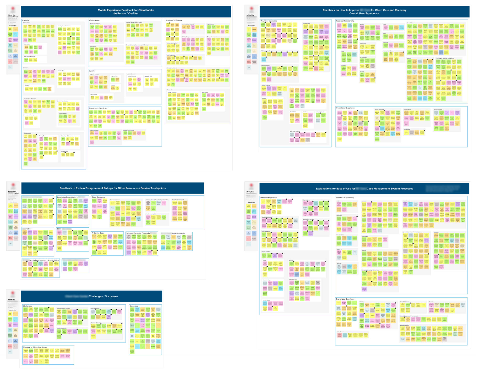
I took the time to read every written response received.
As part of my journey to gather a baseline understanding of the current state, I sent a request to the workforce for design feedback. 678 people participated and contributed 2,233 written responses.
After reading every response it was clear there are still product and service design improvements to be made, especially around ease of use. As part of securing a 1-year grant investment of $500,000, we reported to the donor that the team will continue to work on backlog items that support workforce success via enhancements, user experience improvements, and analyzing pain points in the service’s design.
Surveys provide only one aspect of the design story, but using this feedback gave me an idea of what to focus on first to start working with users directly through research.
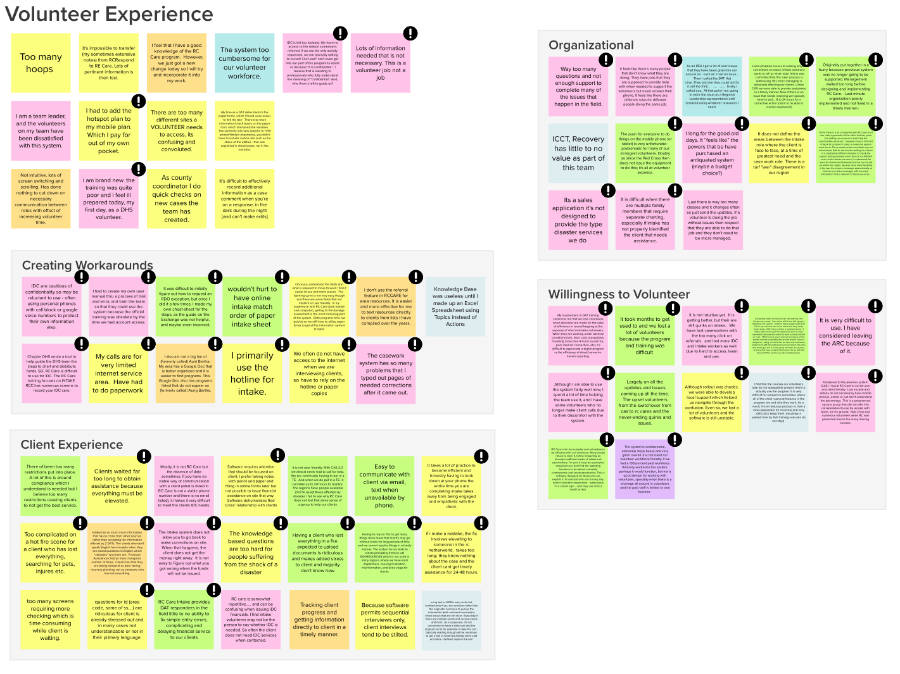
Close-Up View of an Affinity Map Section
Many different themes became apparent through analysis about the service and product design. The most serious comments were flagged with an icon for discussion.
Mind Map from Thematic Analysis
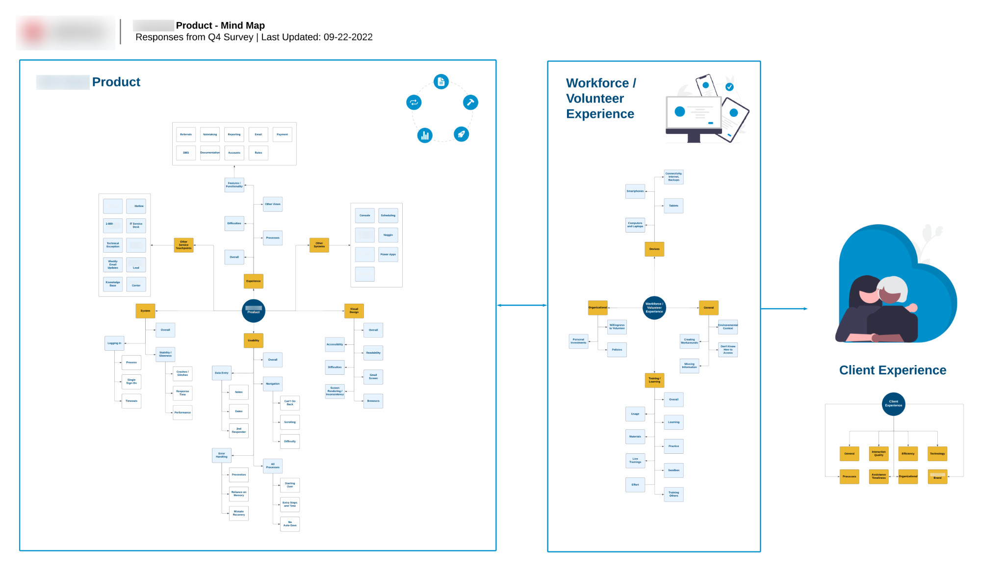
Mind Map from High-Level Affinity Map
I created this mind map to visually communicate to my team how three core areas relate to both product and service design and who experiences them.
Using common themes discovered from five affinity maps, I created a mind map illustrating high-level theme categories, showing how the product experience affects workforce, volunteer, and client experiences as part of overall service design.
Combined themes from all affinity maps were organized in the mind map for each section.
The mind map is grouped into three sections:
- Product: Usability, Experience, System, Other Systems, Other Service Touchpoints, Visual Design
- Workforce / Volunteer Experience: General, Organizational, Training / Learning, Devices
- Client Experience: General, Interaction Quality, Efficiency, Technology, Processes, Assistance Timeliness, Organizational, Brand
Strategic Activities
Impact Map of Service Design Strategy Goals
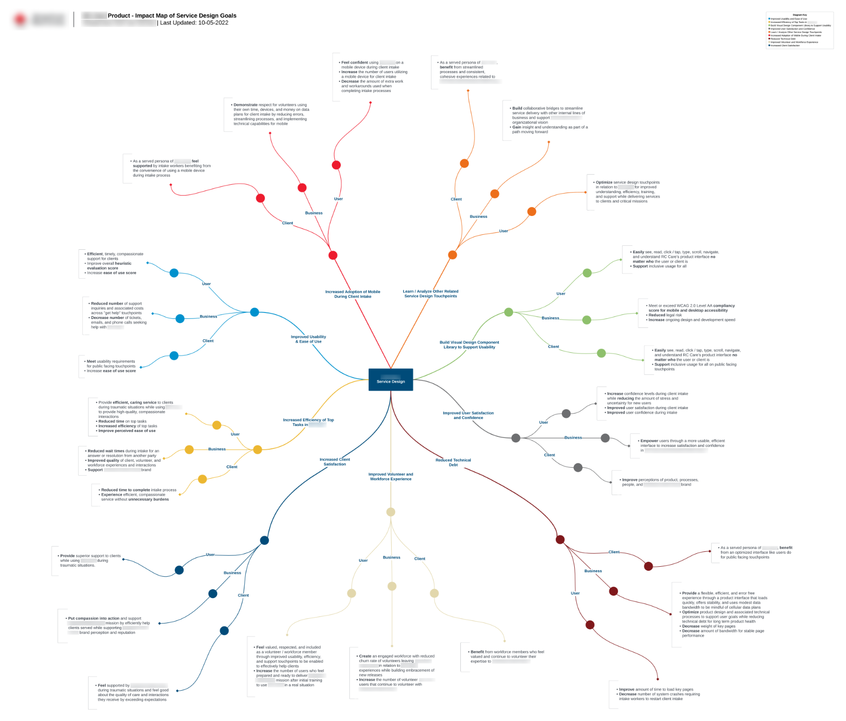
Impact Map of Service Design Strategy Goals
This diagram reminds me of a brain! This visualization illustrates all of the impacts expected to achieve through the service and product design strategy goals and initiatives I proposed to improve service / product design based on user feedback. Each impact is further tied to target key metrics to measure success over time.
The impact map is organized into nine key areas:
- Service design touchpoints
- Usability
- User confidence and satisfaction
- Reduced technical debt
- Improved volunteer and workforce experience
- Increased client satisfaction
- Increased efficiency of top product tasks
- Improved usability and ease of use
- Increased adoption of mobile usage
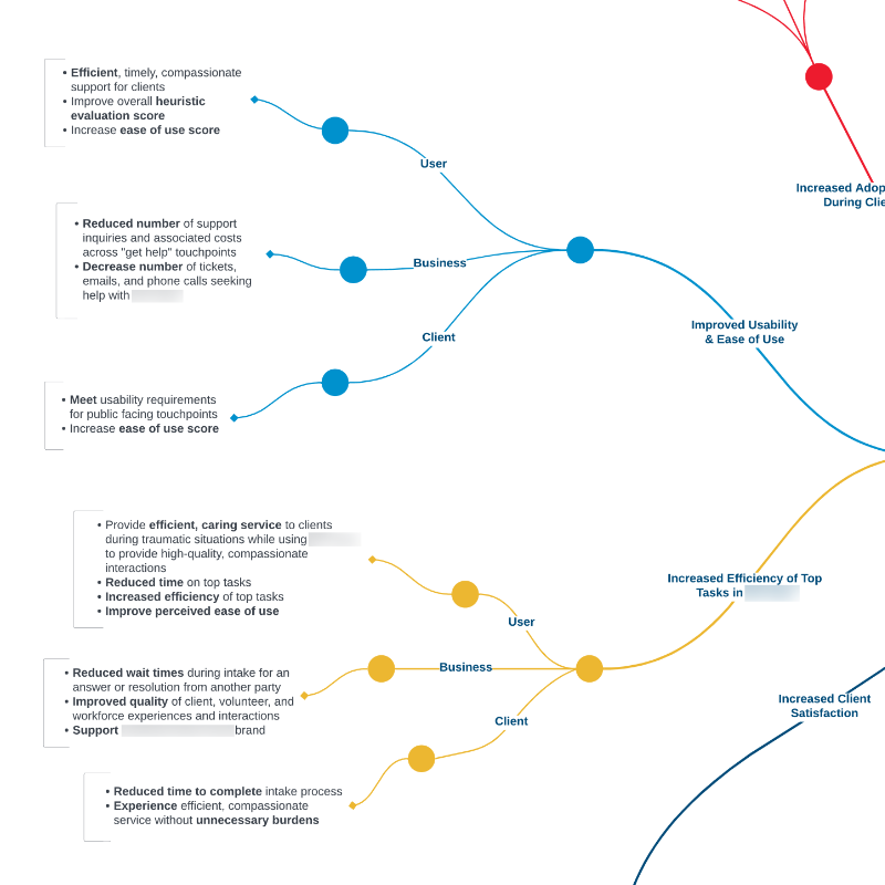
Close-Up View of an Impact Map Section for Usability and Top Tasks
Each area of impact details associated measurements for improving design for users, business, and clients.
Service Design Strategy and Vision
In absence of design strategy, the product historically operated at the execution level, building solutions and features based on issued business requirements before deployment to users—without incorporating human-centered design. The poor results of this approach were reflected in user’s open-ended feedback.
Using the current state as a baseline for learning and iteration, the design strategy has a foundational vision with goals and plans building upon it to achieve the vision prior to executing solutions and features.
I love Nielsen Norman Group’ Components of Design Strategy pyramid visual and adopted this as part of communication to the team.
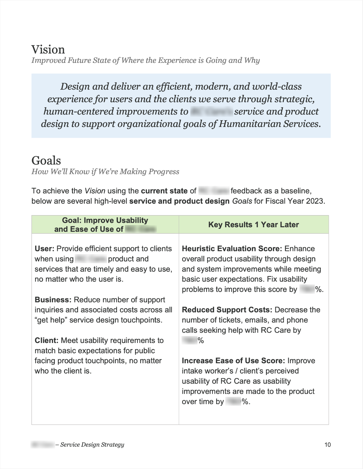
Design Vision Statement
Design and deliver an efficient, modern, and world-class experience for users and the clients we serve through strategic, human-centered improvements to our service and product design to support organizational goals.
To achieve the vision using the current state of feedback as a baseline, I outlined a detailed breakdown of goals pictured in part below.
I wept tears of joy when I saw your service design strategy proposal. Nobody has done this before!
Cover to Service Design Strategy Document
With this strategy document, I earned executive support for design debt reduction, allocating part of $3M+ investment toward remediation.
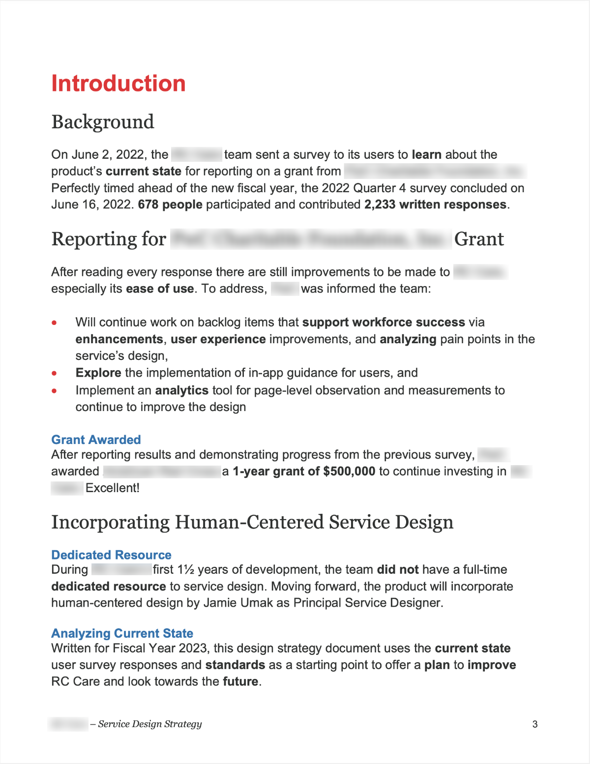
Introduction
The service design strategy opens with an introduction for the team so that it can be revisited.
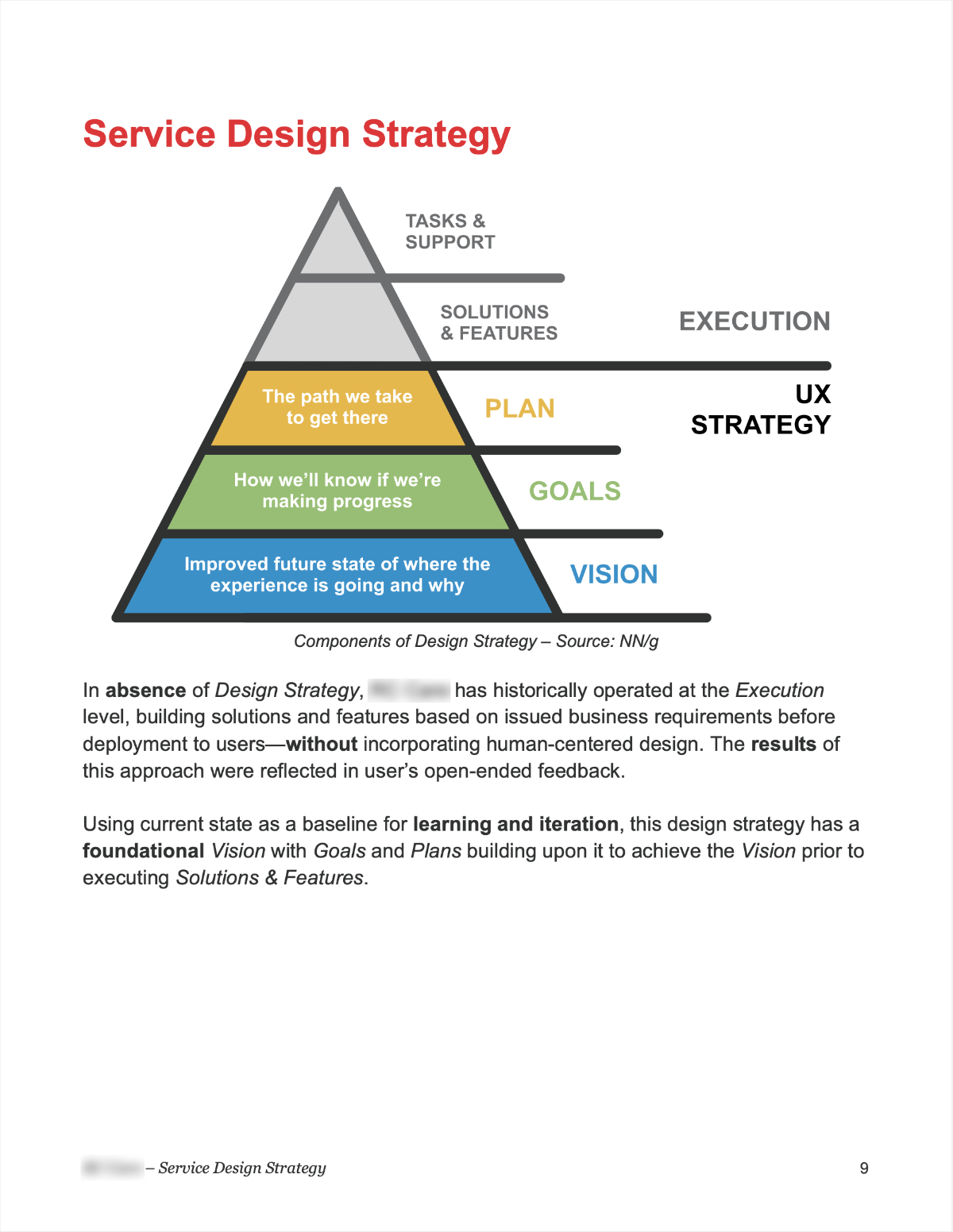
Service Design Strategy Pyramid
Historically the team was operating at the Execution level. This was reflected in user feedback.
Vision – Where the Experience is Going
The high-level vision and its metrics are tied to organizational, user, and client needs.
Goals – How We’ll Know if We’re Progressing
From the Impact Map, specific user, business, and client goals were tied to key measurements.
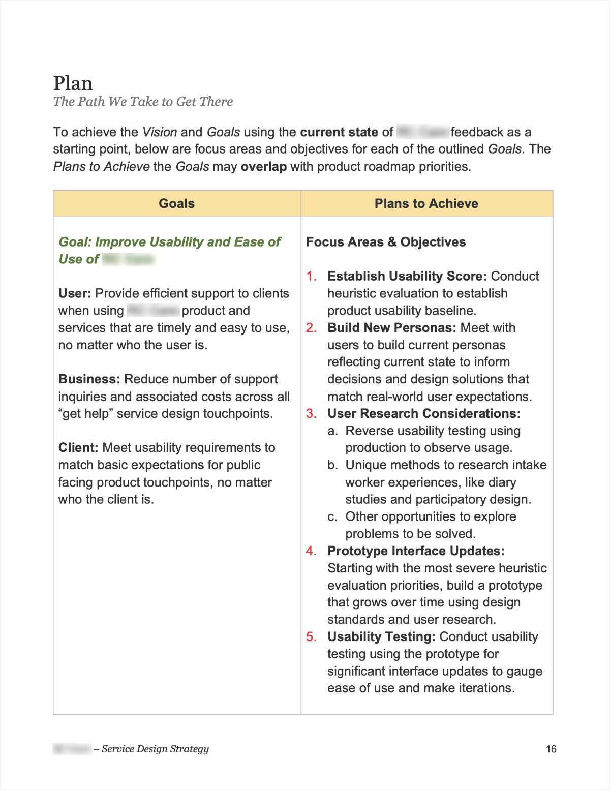
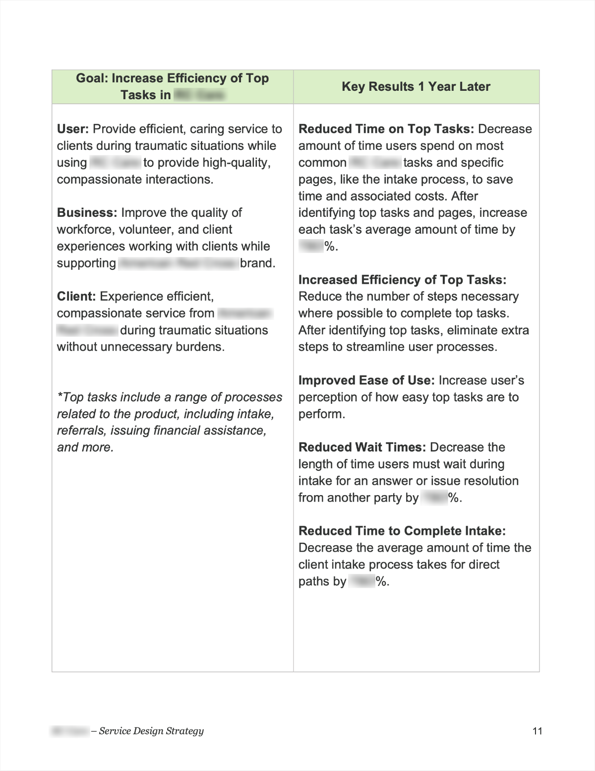
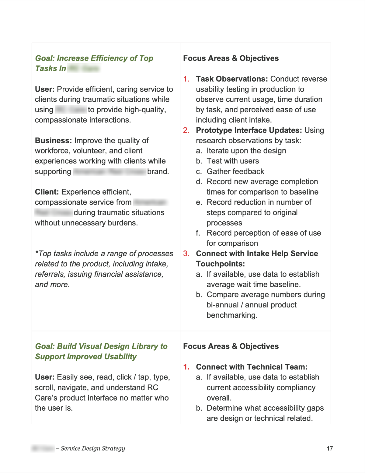
Plan – The Path We’ll Take to Get There
For each goal, plans to achieve them were detailed. These are steps to be taken in order to achieve goals.
Detailed Goal Examples
Pictured is a goal for increasing top task efficiency and user, business, and client benefits.
To Department Vice President: My compliments on setting up a product team with clear positioning for business and design together and for your hire in Jamie! The work Jamie shared regarding the review of operational products is on point!
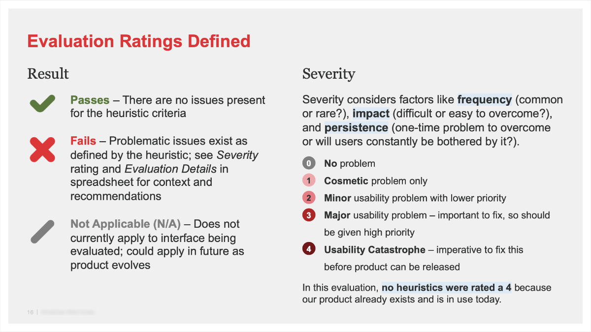
Heuristic Evaluation and Executive Summary
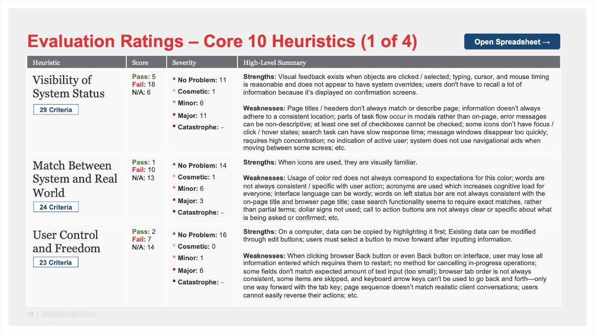
Sample Summary Page from Heuristic Evaluation
I used a spreadsheet to document each heuristic finding but created a summary presentation for ease of team reading and communication.
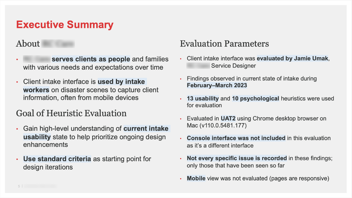
Existing for nearly 30 years, heuristics are one of my favorite methods for evaluating usability. My goal for this evaluation was to gain high-level understanding of current product usability state to help prioritize ongoing design enhancements.
The evaluation uses Jakob Nielsen’s 10 core heuristics, 3 from Deniese Pierotti of Xerox Corporation, 10 psychological heuristics from behavioral psychologist Susan Winschenk, and 6 trauma-informed heuristics by Kelly, Nguyen, and Lauren.
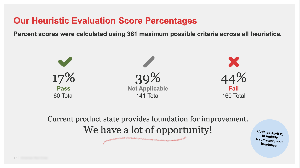
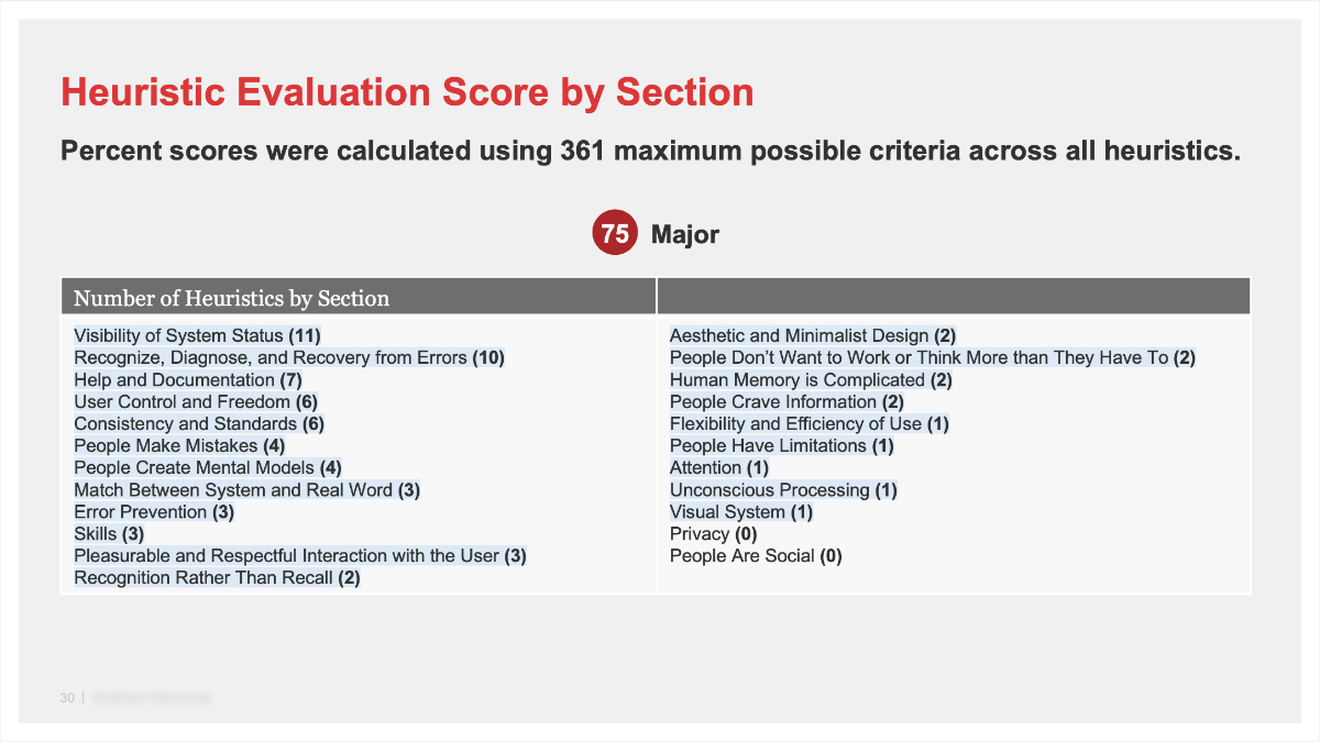
Percent scores were calculated using 361 maximum possible criteria across all heuristics. The resulting scores demonstrated to the team there is a lot of opportunity!
- 17% Pass (60 total criteria)
- 39% Not Applicable (141 total criteria)
- 44% Fail (160 total criteria)
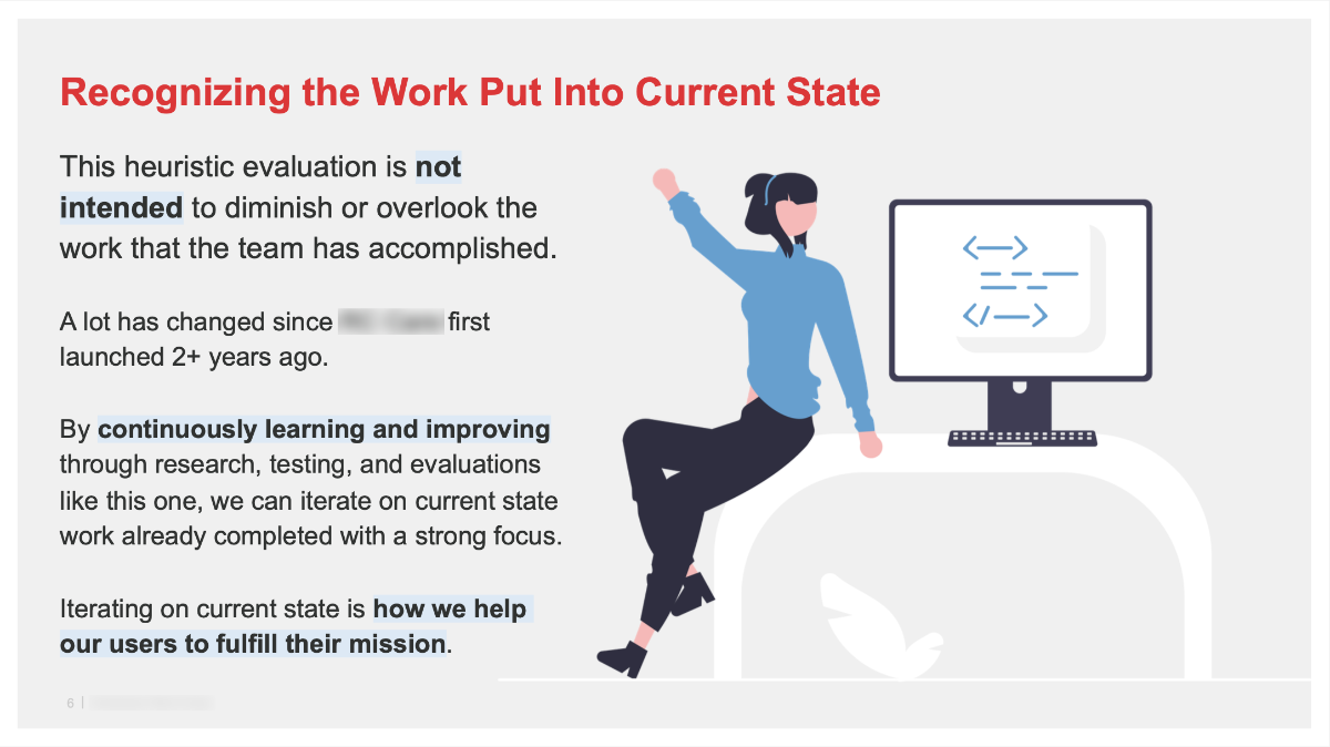
In these conversations, it was also important to let the team know that this didn’t discount the work that was put into current state. Select executive summary pages are below.
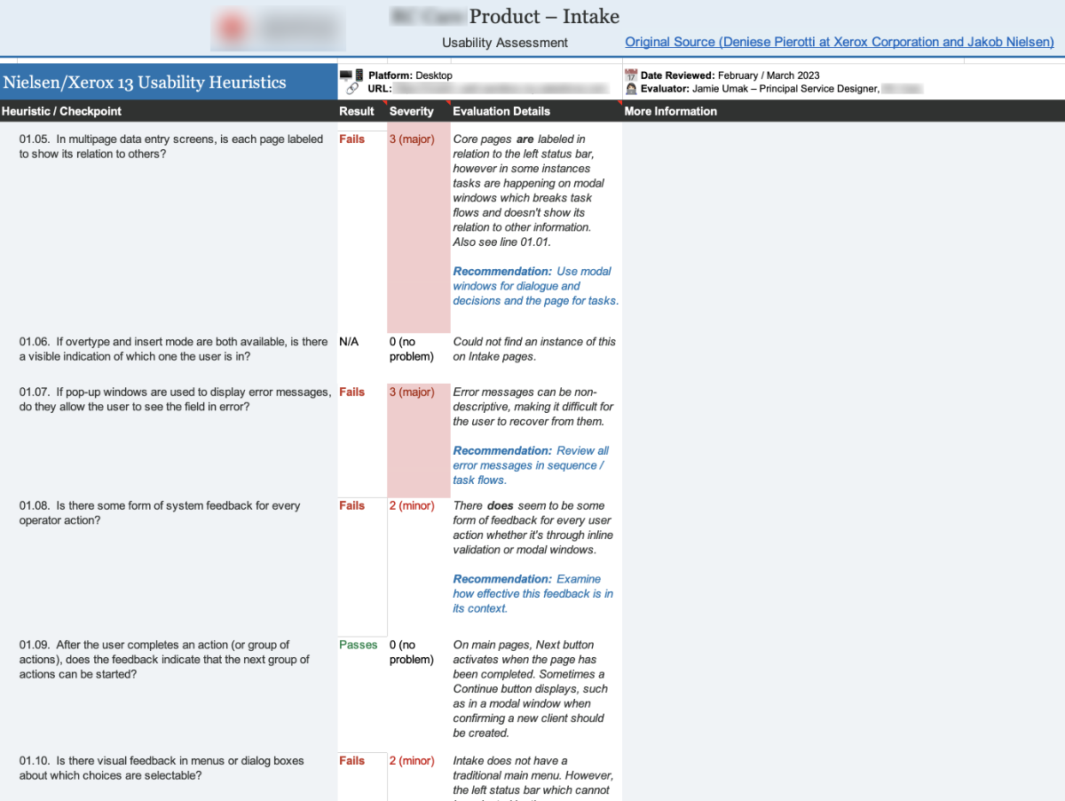
Sample Section of Heuristic Evaluation Spreadsheet
Pictured: Heuristic evaluation spreadsheet section for Visibility of System Status with Major, Minor, and No Problem classifications and explanations.
Your work on the heuristic evaluation is very impressive!
Through my design work of three years, I increased the baseline heuristic analysis score from 27% to 89%. That’s a 62% improvement for usability!
Stepping Stones Vision Canvas
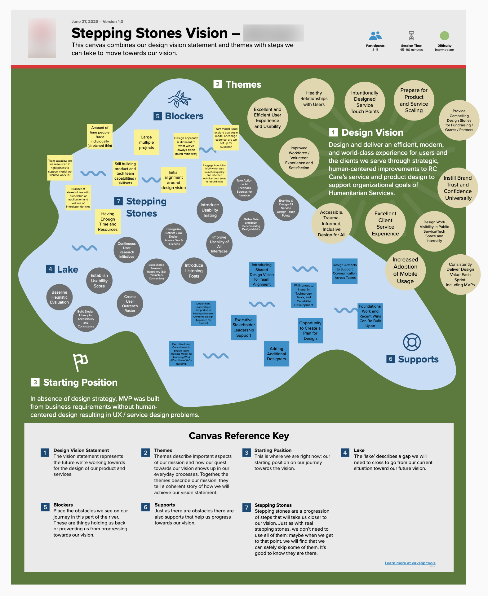
As a companion to the service design strategy plan I created, I facilitated a visioning workshop with key stakeholders. To do this, I was inspired by the Stepping Stones Canvas by WRKSHP.tools.
Using the visual of a lake, I created a board to facilitate the conversation including:
- Design Vision Statement for the team to rally around
- Themes containing ideas about what our design vision meant to us
- Starting Point, where we were at the time without a design strategy
- The Lake, a visual spacing containing stepping stones, blockers, and supports
- Blockers, which are aspects the team believes holds them back from making progress
- Supports that help us get to our design vision
- Stepping Stones are key actions the team can take together to get to our Design Vision
The conversation was incredibly productive. As a newer member to the team at the time I facilitated this, it was helpful to me to learn about the team’s perspectives on our starting point.
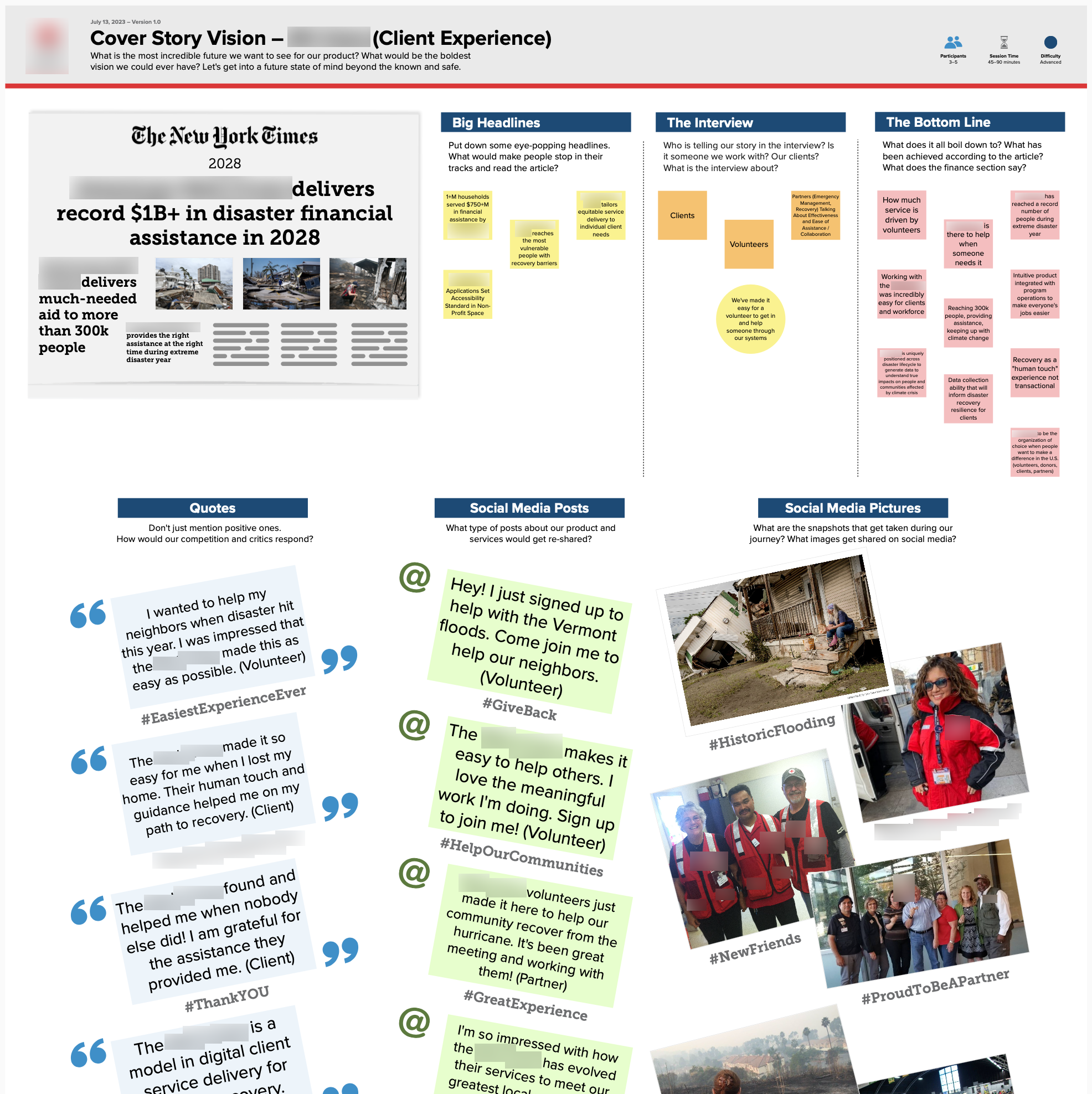
The Cover Story Vision Canvas is an idea I adapted from DesignABetterBusiness.tools. I created a board to facilitate a conversation with critical stakeholders about where they saw us heading in alignment with its future organizational goals. This was a fun conversation to put everyone in the mindset of what we were working towards five years from then:
- Big headlines that would make people stop and pay attention
- What they would want someone interviewed to say about the organization
- What they would want achieved at that time
- Ideas about what people would say on social media along with pictures
User Outreach
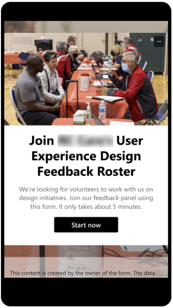
In support of ongoing design initiatives with several personas to consider, I created an opt-in user outreach program to curate a directory of people interested in helping with design activities, like research, workshops, and usability testing. To opt-in, users completed a Microsoft Form with screening questions about their role, location, experience, availability, and time commitment. To attract volunteers, I created internal campaign communications for multiple channels such as weekly email lists, new workforce onboarding, and regional leadership. The campaign was successful, with 150+ sign-ups in the first week.
Stakeholder Feedback
Your contributions to our information technology event, including journey maps and interactive content, made our product demo engaging and showed that we put client and workforce at the center of our design work.